Micro-Interactions That Delight — 7 Examples from Top Apps
In the world of digital design, it’s often the smallest details that leave the biggest impression. Micro-interactions — those subtle animations, feedback loops, and transitions — are the secret sauce that transforms a functional app into a delightful experience. They guide users, provide feedback, and inject personality into interfaces. Let’s explore 7 brilliant examples of micro-interactions from top apps that elevate user experience from ordinary to unforgettable.
Craft

1. ❤️ Instagram’s Like Animation
Press enter or click to view image in full size

When you double-tap a photo on Instagram, a heart briefly pops up and fades away. It’s quick, satisfying, and emotionally resonant. This micro-interaction reinforces the action and adds a touch of joy to a simple gesture.
Why it works:
Immediate visual feedback
Reinforces emotional connection
Encourages repeat engagement
2. 👍 Facebook’s Reactions
Press enter or click to view image in full size
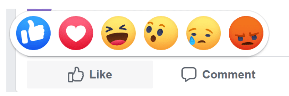
Facebook’s reaction bar isn’t just functional — it’s expressive. Hovering over the “Like” button reveals animated emojis that bounce and respond to your cursor.
Why it works:
Adds nuance to user expression
Smooth, playful animations
Makes interaction feel personal
3. 🔄 Pull-to-Refresh on X (Formerly Twitter)
Press enter or click to view image in full size

Twitter’s pull-to-refresh gesture triggers a satisfying spinner animation. It’s a classic example of a micro-interaction that turns a mundane task into a moment of delight.
Why it works:
Clear feedback loop
Smooth transition
Familiar and intuitive gesture
4. 💬 Slack’s Typing Indicator
Press enter or click to view image in full size

Slack’s animated “typing…” indicator lets you know someone is responding. It’s a tiny detail, but it builds anticipation and keeps conversations fluid.
Why it works:
Real-time feedback
Reduces uncertainty
Enhances conversational flow
5. 🔥 Tinder’s Swipe Animation
Press enter or click to view image in full size
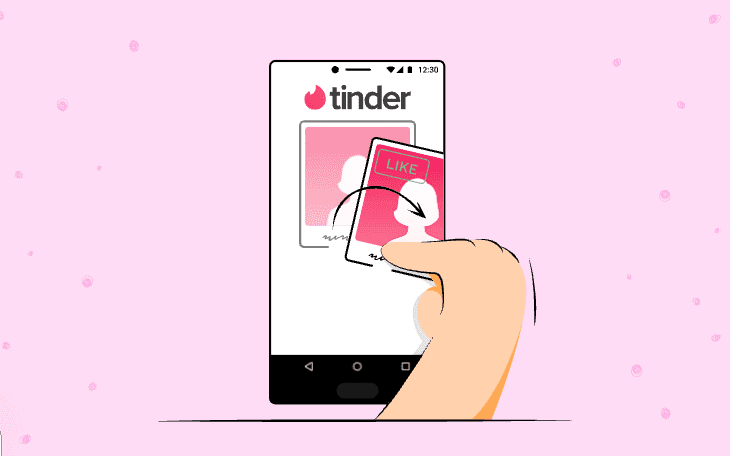
Swiping left or right on Tinder isn’t just a decision — it’s an experience. The cards animate with a slight tilt and bounce, making the action feel tactile and engaging.
Why it works:
Mimics physical interaction
Adds drama to decision-making
Reinforces app’s core mechanic
6. ✅ Duolingo’s Task Completion Animation
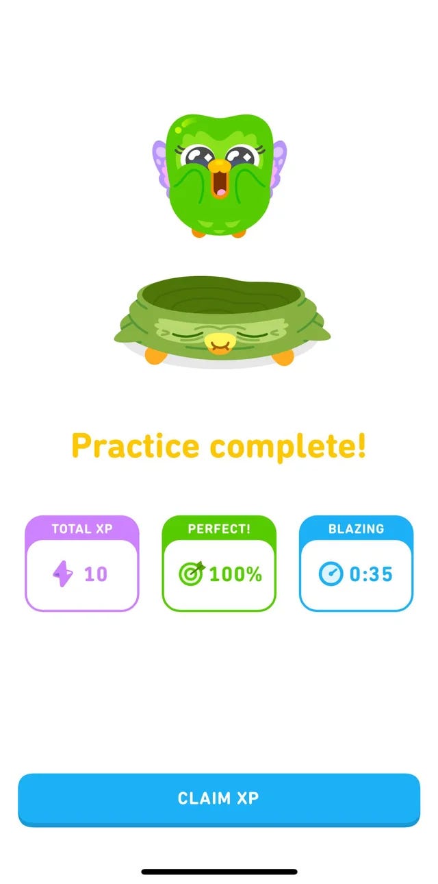
When you finish a lesson on Duolingo, you’re rewarded with cheerful animations and sounds. It’s gamified feedback that makes learning addictive.
Why it works:
Positive reinforcement
Builds habit loops
Encourages continued use
7. 🔍 Google Inbox’s Voice Search
Press enter or click to view image in full size
Though now retired, Google Inbox had a voice search icon that responded with subtle animations when activated. It made the feature feel alive and responsive.
Why it worked:
Immediate feedback
Reinforced trust in voice input
Made the invisible visible
Why Micro-Interactions Matter
Micro-interactions aren’t just decorative — they’re functional. They:
Provide feedback and guidance
Reduce cognitive load
Create emotional resonance
Make digital experiences feel human
As Dan Saffer, author of Microinteractions: Designing with Details, puts it:
“Microinteractions are an exercise in restraint, in doing as much as possible with as little as possible.”
Final Thoughts
Designing delightful micro-interactions is about empathy, timing, and finesse. The best ones are invisible until they’re gone — and once you notice them, you’ll never unsee them.
Whether you’re a designer, developer, or curious user, paying attention to these tiny moments can transform how you think about digital experiences.
More to Discover


Micro-Interactions That Delight — 7 Examples from Top Apps
In the world of digital design, it’s often the smallest details that leave the biggest impression. Micro-interactions — those subtle animations, feedback loops, and transitions — are the secret sauce that transforms a functional app into a delightful experience. They guide users, provide feedback, and inject personality into interfaces. Let’s explore 7 brilliant examples of micro-interactions from top apps that elevate user experience from ordinary to unforgettable.
Craft
1. ❤️ Instagram’s Like Animation
Press enter or click to view image in full size
When you double-tap a photo on Instagram, a heart briefly pops up and fades away. It’s quick, satisfying, and emotionally resonant. This micro-interaction reinforces the action and adds a touch of joy to a simple gesture.
Why it works:
Immediate visual feedback
Reinforces emotional connection
Encourages repeat engagement
2. 👍 Facebook’s Reactions
Press enter or click to view image in full size
Facebook’s reaction bar isn’t just functional — it’s expressive. Hovering over the “Like” button reveals animated emojis that bounce and respond to your cursor.
Why it works:
Adds nuance to user expression
Smooth, playful animations
Makes interaction feel personal
3. 🔄 Pull-to-Refresh on X (Formerly Twitter)
Press enter or click to view image in full size
Twitter’s pull-to-refresh gesture triggers a satisfying spinner animation. It’s a classic example of a micro-interaction that turns a mundane task into a moment of delight.
Why it works:
Clear feedback loop
Smooth transition
Familiar and intuitive gesture
4. 💬 Slack’s Typing Indicator
Press enter or click to view image in full size
Slack’s animated “typing…” indicator lets you know someone is responding. It’s a tiny detail, but it builds anticipation and keeps conversations fluid.
Why it works:
Real-time feedback
Reduces uncertainty
Enhances conversational flow
5. 🔥 Tinder’s Swipe Animation
Press enter or click to view image in full size
Swiping left or right on Tinder isn’t just a decision — it’s an experience. The cards animate with a slight tilt and bounce, making the action feel tactile and engaging.
Why it works:
Mimics physical interaction
Adds drama to decision-making
Reinforces app’s core mechanic
6. ✅ Duolingo’s Task Completion Animation
When you finish a lesson on Duolingo, you’re rewarded with cheerful animations and sounds. It’s gamified feedback that makes learning addictive.
Why it works:
Positive reinforcement
Builds habit loops
Encourages continued use
7. 🔍 Google Inbox’s Voice Search
Press enter or click to view image in full size
Though now retired, Google Inbox had a voice search icon that responded with subtle animations when activated. It made the feature feel alive and responsive.
Why it worked:
Immediate feedback
Reinforced trust in voice input
Made the invisible visible
Why Micro-Interactions Matter
Micro-interactions aren’t just decorative — they’re functional. They:
Provide feedback and guidance
Reduce cognitive load
Create emotional resonance
Make digital experiences feel human
As Dan Saffer, author of Microinteractions: Designing with Details, puts it:
“Microinteractions are an exercise in restraint, in doing as much as possible with as little as possible.”
Final Thoughts
Designing delightful micro-interactions is about empathy, timing, and finesse. The best ones are invisible until they’re gone — and once you notice them, you’ll never unsee them.
Whether you’re a designer, developer, or curious user, paying attention to these tiny moments can transform how you think about digital experiences.
More to Discover
Micro-Interactions That Delight — 7 Examples from Top Apps
In the world of digital design, it’s often the smallest details that leave the biggest impression. Micro-interactions — those subtle animations, feedback loops, and transitions — are the secret sauce that transforms a functional app into a delightful experience. They guide users, provide feedback, and inject personality into interfaces. Let’s explore 7 brilliant examples of micro-interactions from top apps that elevate user experience from ordinary to unforgettable.
Craft
1. ❤️ Instagram’s Like Animation
Press enter or click to view image in full size
When you double-tap a photo on Instagram, a heart briefly pops up and fades away. It’s quick, satisfying, and emotionally resonant. This micro-interaction reinforces the action and adds a touch of joy to a simple gesture.
Why it works:
Immediate visual feedback
Reinforces emotional connection
Encourages repeat engagement
2. 👍 Facebook’s Reactions
Press enter or click to view image in full size
Facebook’s reaction bar isn’t just functional — it’s expressive. Hovering over the “Like” button reveals animated emojis that bounce and respond to your cursor.
Why it works:
Adds nuance to user expression
Smooth, playful animations
Makes interaction feel personal
3. 🔄 Pull-to-Refresh on X (Formerly Twitter)
Press enter or click to view image in full size
Twitter’s pull-to-refresh gesture triggers a satisfying spinner animation. It’s a classic example of a micro-interaction that turns a mundane task into a moment of delight.
Why it works:
Clear feedback loop
Smooth transition
Familiar and intuitive gesture
4. 💬 Slack’s Typing Indicator
Press enter or click to view image in full size
Slack’s animated “typing…” indicator lets you know someone is responding. It’s a tiny detail, but it builds anticipation and keeps conversations fluid.
Why it works:
Real-time feedback
Reduces uncertainty
Enhances conversational flow
5. 🔥 Tinder’s Swipe Animation
Press enter or click to view image in full size
Swiping left or right on Tinder isn’t just a decision — it’s an experience. The cards animate with a slight tilt and bounce, making the action feel tactile and engaging.
Why it works:
Mimics physical interaction
Adds drama to decision-making
Reinforces app’s core mechanic
6. ✅ Duolingo’s Task Completion Animation
When you finish a lesson on Duolingo, you’re rewarded with cheerful animations and sounds. It’s gamified feedback that makes learning addictive.
Why it works:
Positive reinforcement
Builds habit loops
Encourages continued use
7. 🔍 Google Inbox’s Voice Search
Press enter or click to view image in full size
Though now retired, Google Inbox had a voice search icon that responded with subtle animations when activated. It made the feature feel alive and responsive.
Why it worked:
Immediate feedback
Reinforced trust in voice input
Made the invisible visible
Why Micro-Interactions Matter
Micro-interactions aren’t just decorative — they’re functional. They:
Provide feedback and guidance
Reduce cognitive load
Create emotional resonance
Make digital experiences feel human
As Dan Saffer, author of Microinteractions: Designing with Details, puts it:
“Microinteractions are an exercise in restraint, in doing as much as possible with as little as possible.”
Final Thoughts
Designing delightful micro-interactions is about empathy, timing, and finesse. The best ones are invisible until they’re gone — and once you notice them, you’ll never unsee them.
Whether you’re a designer, developer, or curious user, paying attention to these tiny moments can transform how you think about digital experiences.