Product
Infoblox Design Challenge
Three enterprise web components redesigned in a weekend as a hiring challenge and the reason I now work at Infoblox.
Year :
2025
Industry :
Enterprise web · Component design
Client :
Hiring design challenge — led to my current role at Infoblox
Project Duration :
2 Days

Three components, three days, no brief beyond "make this better"
Infoblox gave me three of their live web components and asked me to improve them: the solution resources library, the networking products catalog, and the four-column callout block on the DDI page.
No research budget, no stakeholders to interview, no analytics. Just the production components and a weekend — I started on Saturday 30 August and submitted on Monday 1 September.
That constraint decides the approach. With three days you cannot discover what users need, so the honest move is to work from what the interface itself reveals: what competes for attention, what the visual weight implies about priority, and where the structure contradicts the content. Every decision below came from reading the existing components, not from asserting user needs I had no way to verify.
The resource library was shouting over itself
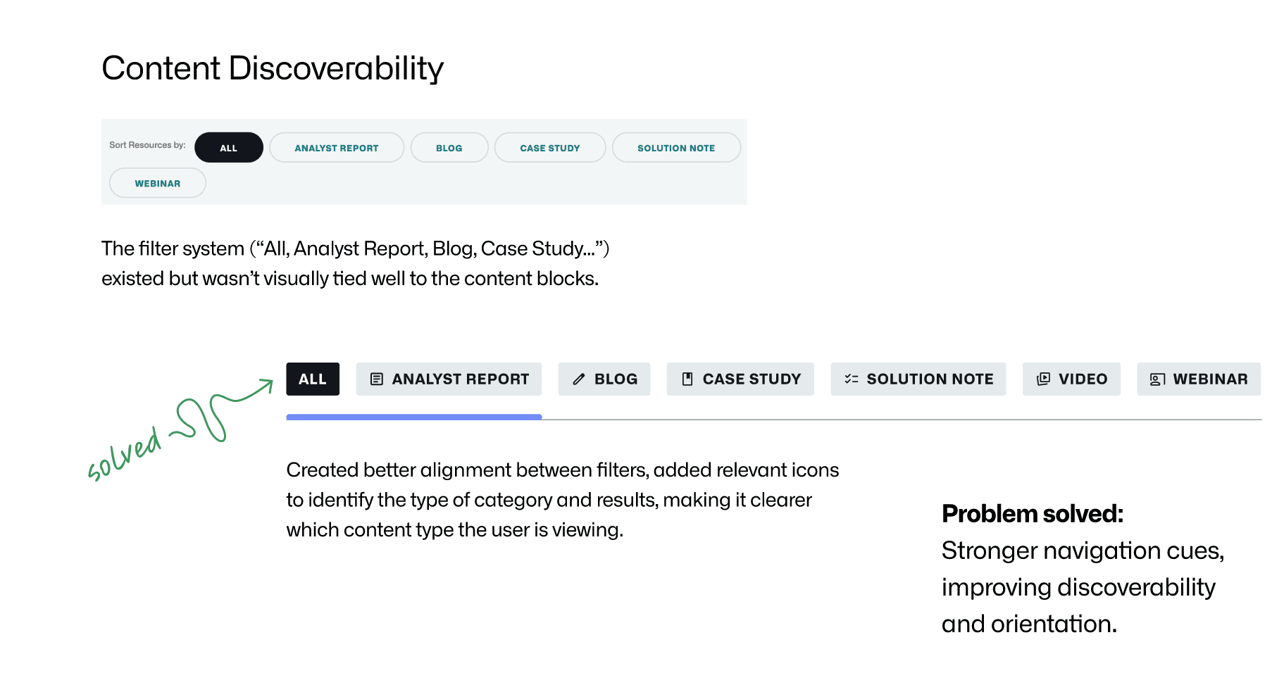
Each card in the resource library carried its category — CASE STUDY, BLOG, REPORT — as oversized text set behind the actual content. The label was decoration, and it sat in direct competition with the headline it was labelling.
Colour made it worse. Categories were saturated at different intensities, so blogs and case studies read as more important than the rest purely as an artefact of hue. On a library where every content type is meant to be equally available, the palette was quietly ranking them.
I stripped the background text out entirely, moved category to a small labelled chip with a type icon, and rebalanced saturation so no card dominates the row. Headline first, description second, one consistent CTA position. The filter bar was already there but floated free of the results — I tied it visually to the grid below and added the same type icons, so the filter and the card it produces share a vocabulary.
What I did not do: add features. The resource library did not need more capability. It needed less noise.

Designing a catalog that survives its ninth product
The product catalog had to hold eight networking products — Universal DDI, NIOS DDI, BloxOne DDI, and the automation tooling around them — with enough room for each to be understood and enough restraint that the set stayed scannable.
I built it as a horizontal carousel on desktop with a persistent section header, description, and a single primary CTA above the cards. Each card is dark, icon-led, and carries only a product name, one line of value, and a "Know more" action. The constraint I held myself to was scalability: the layout had to absorb a ninth and tenth product without redesign, which ruled out any composition that depended on exactly eight items.
On mobile the carousel becomes a vertical stack with tap feedback and spacing tuned for thumb reach, rather than a shrunken version of the desktop scroller.
The four-column callout ran on the opposite principle. Four claims about enterprise DDI, all strategically equal, so the design brief was explicitly to prevent hierarchy from emerging — equal type scale, equal spacing, equal colour weight, no lead item. Restraint is harder to defend in a review than emphasis, which is why I made it the stated rationale rather than leaving it to be read as flatness.


What the challenge proves, and what it doesn't
This is unvalidated work. I had three days, no users, and no measurement, so the claims in it are design reasoning rather than evidence. Reduced visual noise should lower scanning effort, and balanced colour weight should remove unintended ranking — but "should" is the accurate word and I would not defend it as more than that.
What the challenge does show is speed of framing. In three days I diagnosed the actual problem in each component (competition for attention, implied ranking, structural drift between filter and result), designed desktop and mobile states, and specified the interaction layer — hover elevation, CTA transitions, expand-and-collapse for long descriptions.
If I ran it again with real access, the first thing I would ask for is the click distribution across content types in the resource library. My whole colour-weighting argument rests on the assumption that all categories deserve equal prominence, and that assumption is testable in an afternoon. If it turned out that case studies convert at four times the rate of blogs, the correct design is the opposite of what I made.
Infoblox hired me off this work. I have been on the design system since.
🔗👉 Presentation Link: Click here
More Projects




Product
Infoblox Design Challenge
Three enterprise web components redesigned in a weekend as a hiring challenge and the reason I now work at Infoblox.
Year :
2025
Industry :
Enterprise web · Component design
Client :
Hiring design challenge — led to my current role at Infoblox
Project Duration :
2 Days
Three components, three days, no brief beyond "make this better"
Infoblox gave me three of their live web components and asked me to improve them: the solution resources library, the networking products catalog, and the four-column callout block on the DDI page.
No research budget, no stakeholders to interview, no analytics. Just the production components and a weekend — I started on Saturday 30 August and submitted on Monday 1 September.
That constraint decides the approach. With three days you cannot discover what users need, so the honest move is to work from what the interface itself reveals: what competes for attention, what the visual weight implies about priority, and where the structure contradicts the content. Every decision below came from reading the existing components, not from asserting user needs I had no way to verify.
The resource library was shouting over itself
Each card in the resource library carried its category — CASE STUDY, BLOG, REPORT — as oversized text set behind the actual content. The label was decoration, and it sat in direct competition with the headline it was labelling.
Colour made it worse. Categories were saturated at different intensities, so blogs and case studies read as more important than the rest purely as an artefact of hue. On a library where every content type is meant to be equally available, the palette was quietly ranking them.
I stripped the background text out entirely, moved category to a small labelled chip with a type icon, and rebalanced saturation so no card dominates the row. Headline first, description second, one consistent CTA position. The filter bar was already there but floated free of the results — I tied it visually to the grid below and added the same type icons, so the filter and the card it produces share a vocabulary.
What I did not do: add features. The resource library did not need more capability. It needed less noise.
Designing a catalog that survives its ninth product
The product catalog had to hold eight networking products — Universal DDI, NIOS DDI, BloxOne DDI, and the automation tooling around them — with enough room for each to be understood and enough restraint that the set stayed scannable.
I built it as a horizontal carousel on desktop with a persistent section header, description, and a single primary CTA above the cards. Each card is dark, icon-led, and carries only a product name, one line of value, and a "Know more" action. The constraint I held myself to was scalability: the layout had to absorb a ninth and tenth product without redesign, which ruled out any composition that depended on exactly eight items.
On mobile the carousel becomes a vertical stack with tap feedback and spacing tuned for thumb reach, rather than a shrunken version of the desktop scroller.
The four-column callout ran on the opposite principle. Four claims about enterprise DDI, all strategically equal, so the design brief was explicitly to prevent hierarchy from emerging — equal type scale, equal spacing, equal colour weight, no lead item. Restraint is harder to defend in a review than emphasis, which is why I made it the stated rationale rather than leaving it to be read as flatness.
What the challenge proves, and what it doesn't
This is unvalidated work. I had three days, no users, and no measurement, so the claims in it are design reasoning rather than evidence. Reduced visual noise should lower scanning effort, and balanced colour weight should remove unintended ranking — but "should" is the accurate word and I would not defend it as more than that.
What the challenge does show is speed of framing. In three days I diagnosed the actual problem in each component (competition for attention, implied ranking, structural drift between filter and result), designed desktop and mobile states, and specified the interaction layer — hover elevation, CTA transitions, expand-and-collapse for long descriptions.
If I ran it again with real access, the first thing I would ask for is the click distribution across content types in the resource library. My whole colour-weighting argument rests on the assumption that all categories deserve equal prominence, and that assumption is testable in an afternoon. If it turned out that case studies convert at four times the rate of blogs, the correct design is the opposite of what I made.
Infoblox hired me off this work. I have been on the design system since.
🔗👉 Presentation Link: Click here
More Projects
Product
Infoblox Design Challenge
Three enterprise web components redesigned in a weekend as a hiring challenge and the reason I now work at Infoblox.
Year :
2025
Industry :
Enterprise web · Component design
Client :
Hiring design challenge — led to my current role at Infoblox
Project Duration :
2 Days
Three components, three days, no brief beyond "make this better"
Infoblox gave me three of their live web components and asked me to improve them: the solution resources library, the networking products catalog, and the four-column callout block on the DDI page.
No research budget, no stakeholders to interview, no analytics. Just the production components and a weekend — I started on Saturday 30 August and submitted on Monday 1 September.
That constraint decides the approach. With three days you cannot discover what users need, so the honest move is to work from what the interface itself reveals: what competes for attention, what the visual weight implies about priority, and where the structure contradicts the content. Every decision below came from reading the existing components, not from asserting user needs I had no way to verify.
The resource library was shouting over itself
Each card in the resource library carried its category — CASE STUDY, BLOG, REPORT — as oversized text set behind the actual content. The label was decoration, and it sat in direct competition with the headline it was labelling.
Colour made it worse. Categories were saturated at different intensities, so blogs and case studies read as more important than the rest purely as an artefact of hue. On a library where every content type is meant to be equally available, the palette was quietly ranking them.
I stripped the background text out entirely, moved category to a small labelled chip with a type icon, and rebalanced saturation so no card dominates the row. Headline first, description second, one consistent CTA position. The filter bar was already there but floated free of the results — I tied it visually to the grid below and added the same type icons, so the filter and the card it produces share a vocabulary.
What I did not do: add features. The resource library did not need more capability. It needed less noise.
Designing a catalog that survives its ninth product
The product catalog had to hold eight networking products — Universal DDI, NIOS DDI, BloxOne DDI, and the automation tooling around them — with enough room for each to be understood and enough restraint that the set stayed scannable.
I built it as a horizontal carousel on desktop with a persistent section header, description, and a single primary CTA above the cards. Each card is dark, icon-led, and carries only a product name, one line of value, and a "Know more" action. The constraint I held myself to was scalability: the layout had to absorb a ninth and tenth product without redesign, which ruled out any composition that depended on exactly eight items.
On mobile the carousel becomes a vertical stack with tap feedback and spacing tuned for thumb reach, rather than a shrunken version of the desktop scroller.
The four-column callout ran on the opposite principle. Four claims about enterprise DDI, all strategically equal, so the design brief was explicitly to prevent hierarchy from emerging — equal type scale, equal spacing, equal colour weight, no lead item. Restraint is harder to defend in a review than emphasis, which is why I made it the stated rationale rather than leaving it to be read as flatness.
What the challenge proves, and what it doesn't
This is unvalidated work. I had three days, no users, and no measurement, so the claims in it are design reasoning rather than evidence. Reduced visual noise should lower scanning effort, and balanced colour weight should remove unintended ranking — but "should" is the accurate word and I would not defend it as more than that.
What the challenge does show is speed of framing. In three days I diagnosed the actual problem in each component (competition for attention, implied ranking, structural drift between filter and result), designed desktop and mobile states, and specified the interaction layer — hover elevation, CTA transitions, expand-and-collapse for long descriptions.
If I ran it again with real access, the first thing I would ask for is the click distribution across content types in the resource library. My whole colour-weighting argument rests on the assumption that all categories deserve equal prominence, and that assumption is testable in an afternoon. If it turned out that case studies convert at four times the rate of blogs, the correct design is the opposite of what I made.
Infoblox hired me off this work. I have been on the design system since.