Design System
Infoblox Design System
A design system unifying an enterprise brand across internal teams and agency partners. 95% adoption, 20–30% faster production cycles.
Year :
2026
Industry :
Tech
Client :
Infoblox
Project Duration :
12 weeks

The problem wasn't inconsistency
Infoblox's web presence had grown across multiple internal teams and agency partners, each solving the same problems independently. Components were duplicated, patterns diverged, and the brand looked different depending on which page you landed on.
Visual inconsistency was the symptom. The actual problem was that no shared vocabulary existed between the people building the site. Without one, consistency required constant human enforcement — someone catching a divergence in review, someone remembering the correct spacing value. That doesn't scale past a handful of pages.
I reframed the goal: make the consistent path the fastest path. If using the system is easier than not using it, adoption stops being a governance problem.

Audit first, tokens second, components third
I catalogued what already existed across the web ecosystem before designing anything, mapping every variant of every recurring pattern. The inventory turned consolidation from an opinion into an evidence-backed proposal.
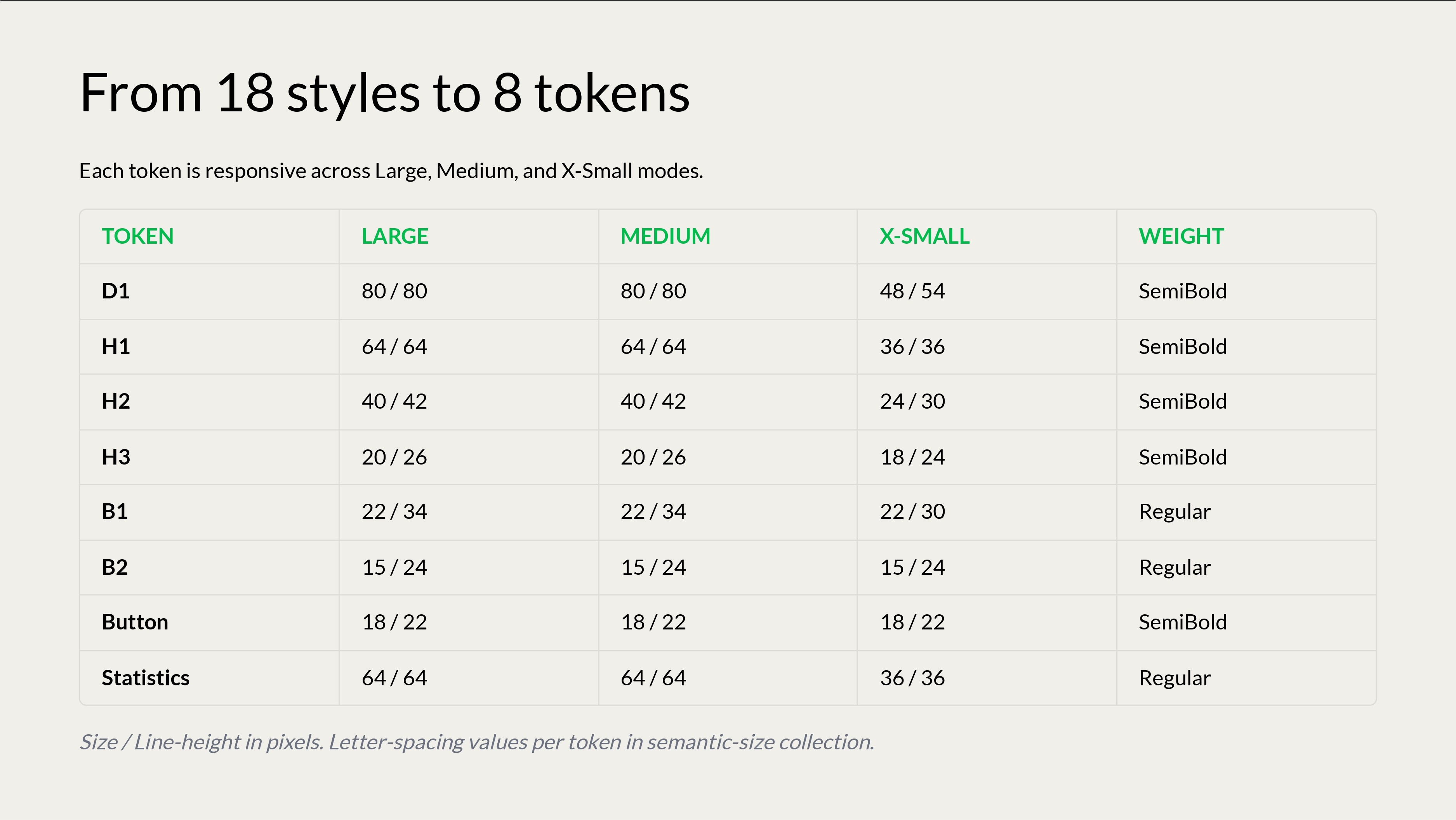
The token layer came before any component. Colour, type, spacing, and motion were defined as tokens first, which meant a brand decision could propagate everywhere instead of being reapplied by hand — and gave agency partners a constrained palette they couldn't drift from.
Accessibility and motion were specified inside each component rather than documented separately. Contrast, focus states, and reduced-motion behaviour shipped as defaults. A separate accessibility checklist is a checklist nobody reads.
Each component shipped with usage rules, do/don't examples, and the reasoning behind each constraint. Agency partners don't read a sixty-page PDF.


The decisions that mattered
Consolidate aggressively. Every extra variant is a decision someone has to make correctly, forever. The trade-off was real
Ship in phases. Rolling out the full system at once would have meant a longer wait for any value at all. Phased release meant teams that succeeded with a small piece became advocates for the next. The cost was a longer runway to full coverage.
Outcome
95%+ adoption across internal web teams and agency partners. 20–30% reduction in web production cycle time through reusable components and tokens. 15–20% reduction in bounce rate across redesigned experiences. 15% higher video watch-through and 10% higher CTR to deeper content, validated through A/B testing.






More Projects




Design System
Infoblox Design System
A design system unifying an enterprise brand across internal teams and agency partners. 95% adoption, 20–30% faster production cycles.
Year :
2026
Industry :
Tech
Client :
Infoblox
Project Duration :
12 weeks
The problem wasn't inconsistency
Infoblox's web presence had grown across multiple internal teams and agency partners, each solving the same problems independently. Components were duplicated, patterns diverged, and the brand looked different depending on which page you landed on.
Visual inconsistency was the symptom. The actual problem was that no shared vocabulary existed between the people building the site. Without one, consistency required constant human enforcement — someone catching a divergence in review, someone remembering the correct spacing value. That doesn't scale past a handful of pages.
I reframed the goal: make the consistent path the fastest path. If using the system is easier than not using it, adoption stops being a governance problem.
Audit first, tokens second, components third
I catalogued what already existed across the web ecosystem before designing anything, mapping every variant of every recurring pattern. The inventory turned consolidation from an opinion into an evidence-backed proposal.
The token layer came before any component. Colour, type, spacing, and motion were defined as tokens first, which meant a brand decision could propagate everywhere instead of being reapplied by hand — and gave agency partners a constrained palette they couldn't drift from.
Accessibility and motion were specified inside each component rather than documented separately. Contrast, focus states, and reduced-motion behaviour shipped as defaults. A separate accessibility checklist is a checklist nobody reads.
Each component shipped with usage rules, do/don't examples, and the reasoning behind each constraint. Agency partners don't read a sixty-page PDF.
The decisions that mattered
Consolidate aggressively. Every extra variant is a decision someone has to make correctly, forever. The trade-off was real
Ship in phases. Rolling out the full system at once would have meant a longer wait for any value at all. Phased release meant teams that succeeded with a small piece became advocates for the next. The cost was a longer runway to full coverage.
Outcome
95%+ adoption across internal web teams and agency partners. 20–30% reduction in web production cycle time through reusable components and tokens. 15–20% reduction in bounce rate across redesigned experiences. 15% higher video watch-through and 10% higher CTR to deeper content, validated through A/B testing.
More Projects
Design System
Infoblox Design System
A design system unifying an enterprise brand across internal teams and agency partners. 95% adoption, 20–30% faster production cycles.
Year :
2026
Industry :
Tech
Client :
Infoblox
Project Duration :
12 weeks
The problem wasn't inconsistency
Infoblox's web presence had grown across multiple internal teams and agency partners, each solving the same problems independently. Components were duplicated, patterns diverged, and the brand looked different depending on which page you landed on.
Visual inconsistency was the symptom. The actual problem was that no shared vocabulary existed between the people building the site. Without one, consistency required constant human enforcement — someone catching a divergence in review, someone remembering the correct spacing value. That doesn't scale past a handful of pages.
I reframed the goal: make the consistent path the fastest path. If using the system is easier than not using it, adoption stops being a governance problem.
Audit first, tokens second, components third
I catalogued what already existed across the web ecosystem before designing anything, mapping every variant of every recurring pattern. The inventory turned consolidation from an opinion into an evidence-backed proposal.
The token layer came before any component. Colour, type, spacing, and motion were defined as tokens first, which meant a brand decision could propagate everywhere instead of being reapplied by hand — and gave agency partners a constrained palette they couldn't drift from.
Accessibility and motion were specified inside each component rather than documented separately. Contrast, focus states, and reduced-motion behaviour shipped as defaults. A separate accessibility checklist is a checklist nobody reads.
Each component shipped with usage rules, do/don't examples, and the reasoning behind each constraint. Agency partners don't read a sixty-page PDF.
The decisions that mattered
Consolidate aggressively. Every extra variant is a decision someone has to make correctly, forever. The trade-off was real
Ship in phases. Rolling out the full system at once would have meant a longer wait for any value at all. Phased release meant teams that succeeded with a small piece became advocates for the next. The cost was a longer runway to full coverage.
Outcome
95%+ adoption across internal web teams and agency partners. 20–30% reduction in web production cycle time through reusable components and tokens. 15–20% reduction in bounce rate across redesigned experiences. 15% higher video watch-through and 10% higher CTR to deeper content, validated through A/B testing.